
I'm a visual creature; most humans are. I love to get meaningful data but can't get my head around it and process it until I get a visual. That's why I love this infographic on natural disasters published in The New York Times.
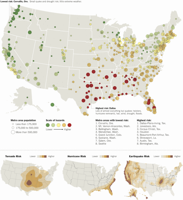
Historical data for hurricanes and twisters and United States Geological Survey assessments of earthquake risks were taken into account to rank 379 American metro areas from lowest to highest risk.
Sure is easier to digest all this data when represented graphically, wouldn't you say?
So what's the takeaway?
Be prepared! Plan and prepare for business continuity so you'll be ready to restore and rebuild.
-
You can access some great resources to draft an emergency plan for your business.
-
Here are 10 Tips for Emergency Spot Coolers to help with your emergency cooling plan.
-
Here's a Business Emergency Plan in pdf you can actually fill in to get you started.
Pretty ironic that the most populated areas of the country have the greatest risk for natural disasters, wouldn't you say? Do you have an emergency plan for your business? Please share your tips and resources here.